White Bathrooms: Choosing the Right White
By the JDI Construction teamReviewed by Arthur Kulchitskiy, Project Consultant, and Denise Lacquement, Designer (bathroom specialist)Updated October 20265 min read
A white bathroom looks right when its whites share an undertone. The tub, toilet and sink whites are fixed by the manufacturer, so gather them first, then choose tile and counter whites that sit comfortably beside them, and pick the paint white last. Vary texture and sheen instead of adding more whites, and add wood, warm metal or warm light so the room does not feel clinical.
White is the default bathroom color for good reasons: it reflects what little light a bathroom gets, it is easy to keep looking fresh, and it goes with every metal. It is also the easiest to get subtly wrong, because a white bathroom is really six or seven whites from different makers: the tub, toilet, sink, tile, grout, counter, paint and trim. When they disagree, the room looks dingy rather than clean. This page explains how to make them agree.
Warm, cool and clean whites
Every white has a slight tint. Hold a sample against a plain sheet of printer paper and the tint shows.
| Type | Beside printer paper | Feel in a bathroom | Pairs with | Clashes with |
|---|---|---|---|---|
| Clean white | Almost disappears | Crisp, bright, can feel stark | Glossy white tile, chrome, black, gray marble look | Cream or bisque fixtures, which look stained beside it |
| Warm white | Faintly cream or yellow | Soft and relaxed; forgiving in cool light | Wood vanities, brass, travertine and beige stone, handmade tile | Blue-white tile and very cool gray grout |
| Cool white | Faintly blue or gray | Calm and fresh; can turn cold in north light | Gray-veined stone, nickel, chrome, blue or gray tile | Cream counters, orange-toned wood |
| Greige or putty white | Clearly a pale stone color | Muted, aged, spa-like | Natural stone, white oak, unlacquered brass | Bright white fixtures, which make it look dull |
Start with the whites you cannot change
In a bathroom the fixtures set the white, not the paint. Vitreous china toilets and sinks, enameled tubs and acrylic tubs and shower bases each come in the maker's own white, and a glossy enameled surface reflects light differently from matte acrylic. You cannot adjust them, so:
- Gather the fixture whites. Ask for sample chips or view the fixtures side by side. If you are keeping an existing tub or toilet, bring a white sample next to it.
- Choose the tile white against them. White tile ranges from blue-white to cream. A tub surround tile that is cooler than the tub makes the tub look yellow; one that is warmer makes the tub look gray.
- Choose the counter. A white quartz or solid surface top sits right beside the sink, so check those two together under the vanity light.
- Choose the grout. See tile and grout color pairings.
- Choose the paint last, with every other sample in hand.
Paint whites and their LRV
Light reflectance value runs from 0 to 100; a higher number reflects more light. Sherwin-Williams prints the LRV on the back of every chip. Whites cluster near the top of the scale, so the differences that matter are undertone more than a few points of LRV. These are manufacturer-published values for a few whites, given as examples, not recommendations:
| Color | LRV (manufacturer) | How it tends to read |
|---|---|---|
| Benjamin Moore Chantilly Lace OC-65 | 90.04 | A very clean white with little visible tint |
| Benjamin Moore Simply White OC-117 | 89.52 | Bright with a slight warm lean |
| Sherwin-Williams Pure White SW 7005 | about 84 | A soft white that stays neutral beside most fixtures |
| Benjamin Moore White Dove OC-17 | 83.16 | A soft, slightly warm white |
| Sherwin-Williams Alabaster SW 7008 | about 82 | A warmer, creamier white |
The right column is our description, not the manufacturer's measurement, and your bathroom light will change it. In a north-facing or windowless room, the clean whites can look gray, and the warmer whites usually hold up better; colors for Pacific Northwest light explains why.
Using one white or several
Using one paint white on walls, ceiling and trim is the simplest choice and rarely looks wrong. Different sheens already make the surfaces look slightly different, since semi-gloss trim reflects more than satin walls. If you want the trim to stand apart, keep it the same undertone and change the sheen or move one step brighter.
What does not work is two unrelated whites that are nearly the same, such as a warm wall white beside a cool tile white. They look like a mismatch, not a choice. When in doubt, match the paint to the tile's undertone and let the tile be the brighter of the two; glazed tile always reads brighter than paint.
Keeping white from feeling clinical
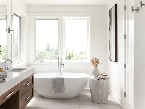
An all-white bathroom with chrome and cool lighting can feel like a clinic. The fix is not more color. It is warmth and texture:
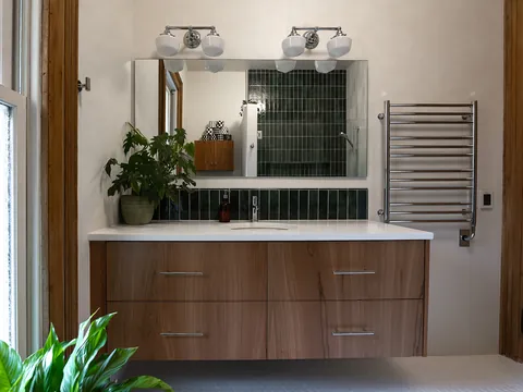
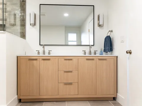
- Wood. A white oak or walnut vanity, a wood shelf or a wood-look floor tile warms the whole room. See vanity colors and wood tones.
- Texture in the tile. Handmade or glazed tile with slight variation, a three-dimensional pattern, or a matte floor beside glossy walls gives a white room depth. See zellige and handmade tile.
- Warm metal. Brass or bronze against white is warmer than chrome or nickel. See bathroom fixture finishes.
- Warm light. Warm-white bulbs at the vanity do more for a cold-feeling white bathroom than a change of paint.
- A darker floor. A floor a few steps darker than the walls grounds the room and hides footprints.
- Textiles. Towels, a rug and a shower curtain, if you use one, are the cheapest way to add color you can change.
Practical points
- White and mineral spots. Dried water leaves white mineral marks. They are nearly invisible on white tile and white fixtures and very visible on black metal and dark tile.
- White and stains. Hair dye, makeup and rust from metal cans show on a white counter and in white grout. Keep the darkest-staining items off porous surfaces.
- Paint sheen. A white wall in a bathroom needs a sheen that tolerates moisture and cleaning. The options are on bathroom wall finishes and paint.
For how whites work across cabinets and counters in a kitchen, the companion page is white kitchens.
Getting it right before tile is ordered
The whites in a bathroom are locked in once tile is ordered and fixtures arrive. JDI's designer pulls fixture, tile, counter and grout samples together for you during design, so the whites are compared in one place before anything is ordered. To start, see our Vancouver bathroom remodeling page.
Common questions
Are all white toilets, tubs and sinks the same white?
No. Fixture makers each have their own white, and materials differ too: vitreous china, enameled cast iron, acrylic and solid surface all reflect light differently. Two white fixtures from different lines can look slightly different side by side. Ask for a sample chip or look at the fixtures together in a showroom before ordering.
Should the shower tile, wall paint and trim all be the same white?
They do not need to be identical, and with different materials they rarely can be. What matters is that they lean the same way. Glossy tile always looks brighter than matte paint of the same color, so many people pick a paint white that is a touch softer than the tile.
What grout color should I use with white tile?
Bright white grout disappears on day one but shows every stain on a floor. On walls it is easier to keep clean. A soft white or very light gray hides wear while keeping the look quiet. See the tile and grout pairings page for the full trade-off.
Do white bathrooms need more cleaning?
White shows hair, makeup and rust stains sooner, but it hides the white mineral spots that water leaves, which show clearly on dark tile, dark glass hardware and black metal. A white bathroom with a slightly darker floor is one of the easier combinations to keep looking clean.
- Benjamin Moore: Chantilly Lace OC-65 (LRV 90.04)
- Benjamin Moore: Simply White OC-117 (LRV 89.52)
- Sherwin-Williams: Pure White SW 7005 (LRV 83.957)
- Benjamin Moore: White Dove OC-17 (LRV 83.16)
- Sherwin-Williams: Alabaster SW 7008 (LRV 82.215)
- Sherwin-Williams: Light reflectance value (LRV) explained
Checked October 2026. Rules, fees and programs change; confirm the current requirement with the agency before you rely on it.
Keep going
- JDI ConstructionBathroom remodeling in Vancouver, WAOur bathroom remodeling service, recent projects and what to expect.
- Exploring · Color and style guidesVanity Colors and Wood TonesChoosing a bathroom vanity color: painted vs stained finishes, walnut and white oak, green and blue vanities, and coordinating the vanity with floor and tile.
- Exploring · Color and style guidesTile and Grout Color PairingsChoosing grout color for bathroom tile: matching vs contrasting grout, colored and handmade tile, floors vs walls, and keeping light grout clean.
- Exploring · Color and style guidesBathroom Fixture Finishes: Chrome, Nickel, Brass and BlackChrome, nickel, brass, bronze and matte black bathroom finishes compared: water spots, cleaning, mixing metals and matching across product lines.