Kitchen Wall Paint: Colors, Sheen and Scrubbability
By the JDI Construction teamReviewed by Arthur Kulchitskiy, CEOUpdated October 20267 min read
Use a washable matte, eggshell or satin finish on kitchen walls, flat on the ceiling and semi-gloss on trim. Higher sheen cleans more easily and shows more wall flaws. Choose the wall color last, after cabinets, counters and backsplash, because paint is the easiest element to adjust. A low-VOC label describes regulated solvent content, not everything a paint emits indoors.
Paint is the least expensive finish in a kitchen and the only one you can change in a weekend, which is why it should be chosen last and fitted to everything else. Two decisions matter more than the exact color: the sheen, which decides how the walls clean and how many flaws they show, and the undertone, which decides whether the walls sit with the cabinets or fight them.
How much wall is there?
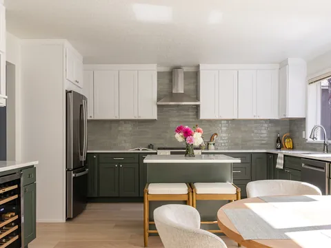
Stand in the kitchen and look for painted wall. In a typical kitchen with upper cabinets and a full backsplash, it comes down to a strip above the cabinets or a soffit, the wall around a window, a short return beside the refrigerator and whatever wall the eating area has. The ceiling is often the largest painted surface in the room.
That has two consequences. A wall color has less influence on the room than a cabinet or counter color, so it is a supporting choice. And because it appears in small, separated patches, a subtle color can vanish completely, while a strong one reads as a set of accents. Kitchens with open shelving or few upper cabinets are the exception: there the wall is a main surface and deserves the same care as the cabinets. The order of decisions is set out in how to choose a kitchen color scheme.
Sheen levels and where each belongs
Sheen is how much light the dried paint reflects. More sheen means a tighter, smoother film that releases grease and wipes clean more easily. It also means every dent, patch and roller mark in the wall is picked out by light.
| Sheen | Look | Cleaning | Shows wall flaws | Use in a kitchen |
|---|---|---|---|---|
| Flat | No shine at any angle | Poorest in standard grades; marks can burnish when rubbed | Least | Ceilings |
| Matte (washable) | Nearly flat, with a soft, even surface | Good in products made to be washed | Little | Walls in older houses with uneven plaster or patched drywall |
| Eggshell | A faint glow when seen along the wall | Good | Some | Most kitchen walls |
| Satin | A noticeable soft sheen | Very good | More | Walls near the range and sink, eating areas, households with children |
| Semi-gloss | Clearly shiny | Excellent | Most | Trim, doors, window casings and sills |
| Gloss | Hard, reflective | Excellent | Everything | Rarely on walls; occasionally on trim or a feature door |
Sheen names are not standardized between manufacturers. The one line drawn in federal rules is between flat and everything else: the EPA's architectural coatings rule (40 CFR 59.401) defines a flat coating as one that registers a gloss of less than 15 on an 85-degree meter or less than 5 on a 60-degree meter, measured by ASTM D523, and a nonflat coating as anything at or above those readings. Eggshell, satin and semi-gloss are makers' own names inside the nonflat group, so one brand's eggshell can be shinier than another's satin. If you are comparing products, look at the gloss readings on the technical data sheets, or paint a sample board of each.
Washable and scrubbable
Kitchen walls collect airborne grease, steam and fingerprints, so the paint has to survive cleaning. Two different properties are involved. Washability is how easily a stain comes off. Scrub resistance is how much rubbing the film takes before it wears through; paint makers measure it with standardized laboratory scrub tests. Neither word on a label is a guarantee, so compare data sheets within a brand's range.
- Higher grades in a product line generally have more and better binder, and they wash better at the same sheen.
- Premium washable mattes exist for people who want a low sheen. A standard flat is a poor choice beside a range.
- Clean with a soft cloth and mild dish soap in water. Abrasive pads leave shiny patches, most visibly on dark colors and low sheens.
- Paint is not a backsplash. Behind the sink and range, tile or slab does the job; see kitchen backsplashes and wall finishes.
Ceilings and trim
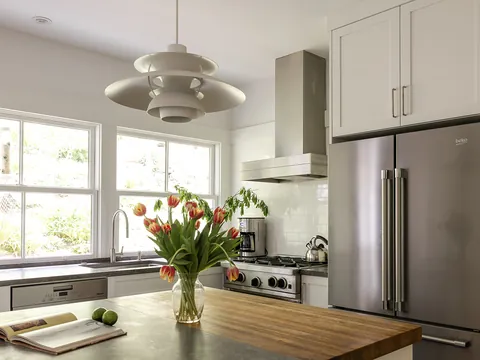
Use flat on the ceiling. Kitchen ceilings are lit at a shallow angle by pendants and under-cabinet light spilling upward, and any sheen shows every drywall joint. A ceiling paint with some washability is worth having above a range.
Trim is normally semi-gloss, for durability and so it reads as a separate element from the wall. The difficulty in a kitchen is that trim sits right next to cabinets. Cabinets are finished in a factory or shop coating, not wall paint, and a store-mixed trim paint in "the same white" seldom matches in color or sheen. Either have the trim color matched to an actual cabinet door, or choose a trim white that is clearly different from the cabinets. Whites are covered in white kitchens.
Coordinating walls with cabinets
| Cabinets | Wall color that works | What to avoid |
|---|---|---|
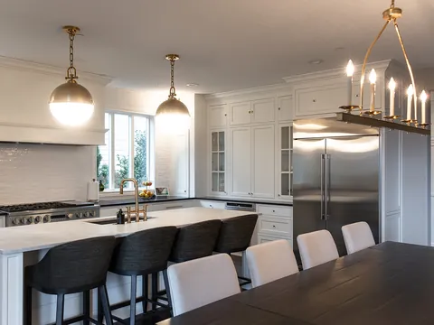
| White or cream | The cabinet white in a lower sheen, or a pale neutral two or three steps deeper so the cabinets stand out | A white with a different undertone, which makes one of them look dirty |
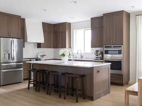
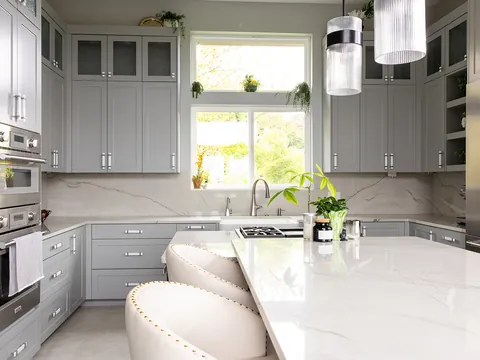
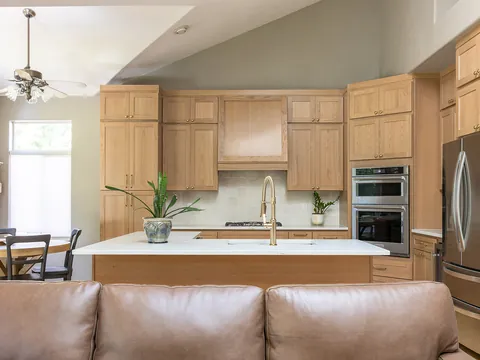
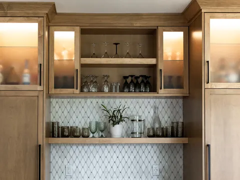
| Natural or stained wood | Off-white without pink or yellow, soft green, gray-green, or a warm gray | Yellow-beige and peach, which push oak and maple toward orange |
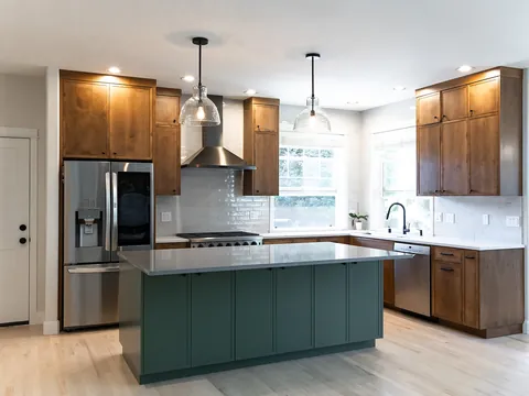
| Green or blue | Warm white or pale neutral; let the cabinets be the color | A second strong color on the walls |
| Dark (charcoal, navy, black, espresso) | A light wall with high reflectance, to keep the room bright | Mid-tone walls, which make the whole room read dark |
| Gray | A warm white, or a gray clearly lighter than the cabinets in the same undertone | A gray of similar depth with a different lean |
Light reflectance value (LRV) is the manufacturer's measure of how much light a color reflects, on a scale where higher numbers are lighter. It is the quickest way to compare depth between colors. The examples below are Benjamin Moore colors with the LRV each one's own color page lists. They are illustrations of depth and undertone, not recommendations, and every one should be sampled in your kitchen.
| Color | LRV | Description | Sits with |
|---|---|---|---|
| Pale Oak OC-20 | 68.64 | A very light warm greige, close to an off-white | White cabinets where a slight contrast is wanted; wood cabinets |
| Edgecomb Gray HC-173 | 63.09 | A light gray-beige with a warm cast | White and cream cabinets, warm stone counters |
| Palladian Blue HC-144 | 60.4 | A soft blue-green | White cabinets, natural wood, kitchens short on color |
| Kendall Charcoal HC-166 | 14.61 | A deep, warm charcoal | An accent wall or eating area beside light cabinets |
Vancouver's gray daylight pulls colors cooler and duller than they look on a chip. How to allow for that is explained in choosing kitchen colors for Pacific Northwest light.
What a low-VOC label does and does not tell you
VOCs, volatile organic compounds, are the solvents and other carbon-based chemicals that evaporate from paint as it dries. The EPA limits the VOC content of architectural paints sold in the United States: under 40 CFR Part 59, Subpart D, the national limit is 250 grams per liter for flat coatings and 380 grams per liter for nonflat coatings. Three points about what those numbers mean:
- The rule is about outdoor air. The EPA says it regulates VOCs outdoors mainly because of their ability to form photochemical smog, and that no federally enforceable standards have been set for VOCs in non-industrial indoor settings.
- The content figure leaves things out. The federal limit is calculated excluding water, exempt compounds and colorant added to tint bases. Tinting a base to a deep color can add VOCs that the base's label does not count, and compounds exempt from the smog rules can still be emitted indoors.
- "Low-VOC" and "zero-VOC" are not standardized terms. The EPA notes that VOC labels and certification programs may not assess all the VOCs a product emits, and that the lack of common requirements makes labels hard for consumers to interpret.
In practice: ask for the VOC content of the tinted paint, not the base; look for a third-party emissions certification, and find out what it tests; and ventilate. The EPA's advice is to increase ventilation when using products that emit VOCs and to follow label instructions. Keep windows open and the range hood running during painting and while the paint cures.
Preparation and timing
Kitchen walls must be degreased before painting, since paint does not bond to cooking residue. Stains, patches and new drywall need the right primer. In a remodel, walls are usually primed and given a first coat before cabinets go in, and the final coat follows the backsplash, so that cabinet installation and tile work do not mark finished paint. JDI Construction schedules painting as part of the project and confirms colors and sheens with you before paint is ordered. To talk through a project, contact us or see our Vancouver kitchen remodeling page.
Common questions
Can I use wall paint on kitchen cabinets?
It is not a good idea. Ordinary wall paint stays relatively soft and will mark, stick and chip on doors and drawer fronts that are handled all day. Cabinets need a coating made for them, applied over the right primer. The options are explained on the cabinet finishes page of this guide.
Do I need a paint labelled for kitchens and baths?
Not necessarily. Those products are typically formulated to resist moisture and mildew, which matters more in a steamy bathroom than in a kitchen with a working range hood. In a kitchen the properties to look for are washability and stain resistance in the sheen you want. Check the product data sheet instead of relying on the name.
How soon can I wash newly painted kitchen walls?
Later than you can touch them. Paint is dry to the touch long before it reaches full hardness, and scrubbing a film that has not cured can burnish or remove it. The cure time is on the can or the product data sheet. Until then, blot splashes with a damp cloth and avoid cleaners.
Does a dark wall color make a small kitchen feel smaller?
Less than people expect, because so little wall is exposed in most kitchens. A deep color on a short stretch of wall between light cabinets and a light ceiling reads as an accent. It matters more in a kitchen with few upper cabinets, where the wall is a large share of what you see, and in rooms with little daylight.
Should the kitchen ceiling be white?
Usually a white or near-white, because the ceiling reflects light back onto the counters. It does not have to be a stark white. A ceiling in the same white as the trim, or in the wall color lightened considerably, avoids a hard line where wall meets ceiling in a room with warm cabinets.
- 40 CFR 59.401: definitions for the national VOC emission standards for architectural coatings (flat and nonflat coatings)
- 40 CFR Part 59, Subpart D, Table 1: VOC content limits for architectural coatings
- U.S. EPA: Technical Overview of Volatile Organic Compounds
- U.S. EPA: Volatile Organic Compounds' Impact on Indoor Air Quality
- Benjamin Moore: Pale Oak OC-20
- Benjamin Moore: Edgecomb Gray HC-173
- Benjamin Moore: Palladian Blue HC-144
- Benjamin Moore: Kendall Charcoal HC-166
Checked October 2026. Rules, fees and programs change; confirm the current requirement with the agency before you rely on it.
Keep going
- Exploring · Color and style guidesWhite Kitchens: Choosing the Right White for Cabinets, Counters and WallsHow to choose whites for kitchen cabinets, counters, tile, walls and trim: undertones, LRV, sheen, matching across materials and keeping white warm.
- Exploring · Color and style guidesHow to Choose a Kitchen Color SchemeA step-by-step way to build a kitchen color scheme: start with fixed elements, read undertones, set contrast with value, and sample in your own light.
- JDI ConstructionKitchen remodeling in Vancouver, WAOur kitchen remodeling service, recent projects and what to expect.
- Exploring · Color and style guidesKitchen Styles Explained: Modern, Transitional, Farmhouse, Craftsman, Mid-Century and ScandinavianSix kitchen styles explained by their cabinet doors, materials, colors, hardware and lighting, with the Vancouver house types each one suits and how to blend.