Countertop and Cabinet Color Pairings That Work
By the JDI Construction teamReviewed by Arthur Kulchitskiy, CEOUpdated October 20266 min read
Pair a countertop to cabinets by checking three things in order: the stone's background color must share the cabinet's undertone (warm with warm, cool with cool), the two should either match closely or differ clearly in depth, and only one of them should carry strong pattern. Then use the backsplash to connect them, and approve the actual slab, not a small sample.
The countertop and the cabinets meet along every edge in the kitchen, so the pair is seen together from every angle. A pairing fails for one of three reasons: the undertones disagree, the two are almost but not quite the same depth, or both are competing for attention. This page shows how to check each one and gives starting points by cabinet color.
Three checks for any pairing
- Temperature. Look at the background of the countertop, ignoring the veining for a moment. It is either warm (cream, ivory, beige, tan, gold, brown) or cool (bright white, gray, blue-gray, black with a blue cast). The cabinet color has a temperature too. Keep them on the same side, or make the opposite temperature a clear, deliberate accent.
- Depth. Decide whether you want the counter to match the cabinets in lightness or contrast with them. Both are fine. The uncomfortable zone is the near miss, where they are a step apart and look like a failed match.
- Pattern. One element leads. Plain painted cabinets can take a counter with movement. Cabinets with strong grain, such as oak or hickory, want a quiet counter. If you are unsure how the temperature idea works, how to choose a kitchen color scheme explains undertones from the start.
Warm stone, cool stone
| Countertop look | Temperature | Typical description | Easy cabinet partners |
|---|---|---|---|
| White with gray veining | Cool | Bright white field, soft or bold gray lines | Clean and cool whites, gray, navy, black |
| White with gold or taupe veining | Warm | Ivory or soft white field, beige, gold or brown lines | Warm whites, greige, green, walnut, oak |
| Solid or fine-speckled white | Either; check against paper | Even, quiet surface | Almost anything of the same undertone |
| Cream, beige and tan stone | Warm | Mottled or flowing warm neutrals | Warm whites, mid and dark wood, olive green |
| Gray, concrete-look | Usually cool | Flat mid-gray, matte | White, pale wood, black; needs wood or brass for warmth |
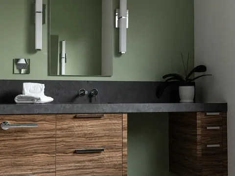
| Black and charcoal, plain or lightly veined | Neutral to cool | Deep, matte or polished; includes soapstone looks | White, pale and mid wood, sage green |
| Green and blue-green stone | Varies | Strong color and movement | Plain whites and quiet wood only |
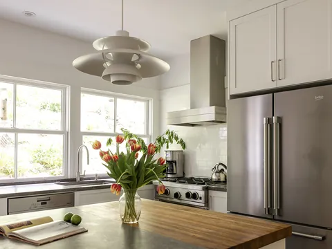
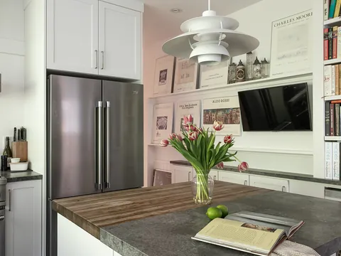
| Wood (butcher block) | Warm | Visible grain, honey to dark brown | Painted cabinets of any color; not same-species wood cabinets |
Material choice affects the range of looks available. Engineered quartz is consistent from slab to slab, while granite, quartzite and marble vary. The practical differences are in quartz vs. granite and the overview in choosing kitchen countertops.
Pairings by cabinet color
| Cabinets | Works well | Why | Be careful with |
|---|---|---|---|
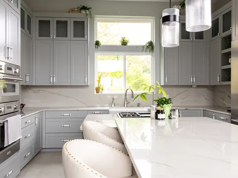
| Clean or cool white | White with gray veining; pale gray; black or charcoal | Same cool family; black gives a classic high-contrast line | Cream or beige stone, which makes the cabinets look blue and the counter look yellowed |
| Warm white or cream | Ivory-field stone with gold or taupe veining; warm mid-brown stone; butcher block; soft black | Shared warmth; the black adds definition without clashing | Stark blue-white quartz, which makes cream look dingy |
| Light wood (natural maple, white oak) | Solid or lightly veined white; soft black; concrete-look gray | Quiet surfaces let the grain be the pattern | Beige stone the same depth as the wood, which blurs into it |
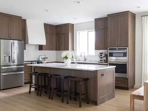
| Mid and red-brown wood (cherry, stained oak, walnut) | Warm white with gentle veining; cream; deep green or black stone | Light counters lift the wood; dark ones make it look rich | Busy speckled stone in browns and golds, which doubles the pattern and dates the room |
| Sage and gray-green | Warm white with taupe veining; butcher block; soft black; honed pale stone | Green sits naturally with warm neutrals and wood | Cool blue-gray veining, which turns the green muddy |
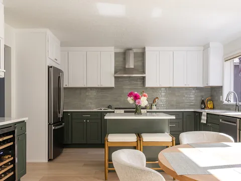
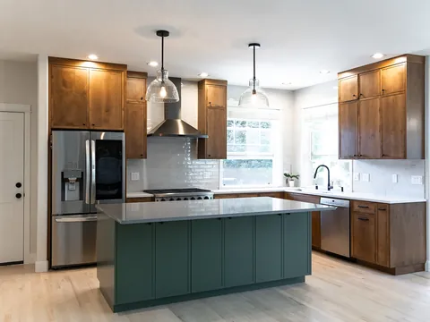
| Deep green | White with warm veining; wood; pale cream stone | Strong contrast keeps the work surface bright | Dark counters, unless the room has a lot of light |
| Navy and deep blue | White with gray or soft gold veining; butcher block; pale gray | White sharpens navy; wood warms it | Black counters, which merge with navy into one dark mass |
| Greige and taupe | White a clear step lighter; stone whose veining repeats the cabinet color | Repeating the cabinet color in the veining ties the two together | Any stone with a different undertone; check for pink against green |
| Black and charcoal | White or pale stone; light wood; warm veined marble looks | The counter provides the light the cabinets absorb | Black on black, which hides the edge of the counter and needs strong lighting |
For the behavior of each cabinet color on its own, see kitchen cabinet colors. White-on-white combinations have their own difficulties, covered in white kitchens.
Veining scale and movement
"Movement" is the trade's word for how much a slab's pattern flows and varies. It matters as much as color.
- Fine, even pattern (small speckle, tight grain) reads as a solid color from a few feet away. It suits any size of kitchen and any cabinet style, and seams are easy to hide.
- Soft, medium veining adds interest without taking over. It is the easiest patterned choice to pair.
- Bold, large-scale veining is a feature in itself. It needs an uninterrupted surface to be seen, so it suits a large island more than a perimeter counter chopped up by a sink, a range and a corner. Seams have to be planned so the veins line up, and that planning is done with the fabricator on the real slabs.
Match the scale to the room and to the cabinets. Small kitchens and detailed door styles (raised panel, beaded inset) usually look calmer with quieter stone. Plain slab or Shaker doors in a larger room can carry a dramatic slab. If the kitchen has two cabinet colors, the counter has to work with both; two-tone kitchens covers that case. Finish also plays a part, since honing softens veining and polishing sharpens it; see countertop finishes, edge profiles and thickness.
Matching versus contrasting
| Approach | Example in words | Result | Suits |
|---|---|---|---|
| Tone-on-tone | Warm white cabinets, ivory counter with faint veining | Calm, continuous, makes the room feel larger | Small kitchens; schemes where the tile or floor is the feature |
| Moderate contrast | Sage cabinets, warm white counter | Defined but relaxed | Most kitchens; the most forgiving option |
| High contrast | White cabinets, soft black counter; or black cabinets, white counter | Crisp horizontal lines; emphasizes layout | Larger or well-lit rooms; modern and classic styles alike |
The backsplash as mediator
The backsplash sits between the counter and the upper cabinets and touches both, so it is the surface that makes a pairing look resolved. Three reliable approaches:
- Take its color from the cabinets when the counter is the feature. A plain tile in the cabinet's white lets a veined slab stand out.
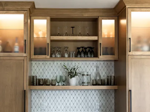
- Take its color from the countertop's background or veining when the cabinets are a strong color. A tile that picks up the stone's secondary color links counter and cabinet.
- Run the countertop material up the wall as a slab backsplash for the most continuous look. JDI's published planning range for a quartz or stone slab backsplash as an add-on is $3,000-$8,000 before sales tax, which is a planning range, not a quote.
Avoid introducing a third undertone in the tile. More in backsplash and grout colors.
How to view and approve slabs
- Bring your samples to the slab yard: a finished cabinet door, a floor plank and the tile if chosen.
- Stand the door against the slab and step back ten feet. Check temperature first, then depth.
- Look at the whole slab, including the areas with the most and least veining. Ask which part will be used where.
- If the job needs more than one slab, see them side by side and confirm they come from the same lot or block.
- Ask where the seams will fall and how the pattern will run across them and around the sink.
- Take a photograph of the tagged slab you approved, with its identification visible.
- Bring a piece home if one is offered and look at it flat on the existing counter beside the door sample, in daylight and under your evening lighting.
Where to go next
With cabinets and countertop paired, the remaining color decisions are tile, floor and metal finishes. JDI Construction helps you compare door, slab and tile samples together during design, before the cabinet order and the countertop template lock the choices in. To start, visit our Vancouver kitchen remodeling page.
Common questions
Should the countertop be lighter or darker than the cabinets?
Either works, as long as the difference is deliberate. A light counter on dark cabinets brightens the work surface and is the easier combination to light. A dark counter on light cabinets gives a strong horizontal line and hides stains but shows crumbs, dust and water marks. A counter close to the cabinet color gives a quiet, continuous look that relies on texture for interest.
Which do I choose first, the countertop or the cabinet color?
Choose whichever has fewer options that you like. Natural stone is the usual answer, because each slab is unique and you cannot adjust it, while a cabinet color can often be matched to suit. If you are set on a particular cabinet color, take a finished sample door with you when you shop for slabs.
Do I need to match the countertop to the floor as well?
The floor should agree in undertone and differ in depth from at least one of the other two large surfaces. A useful check is to lay the cabinet door, the countertop sample and a floor plank together: if all three are the same depth the room will look flat, and if all three have pattern it will look busy.
Why does my small sample look different from the slab?
A hand-sized piece shows a few square inches of a surface that varies over many square feet. Natural stone can change color and veining across a single slab, and engineered slabs with large veining repeat their pattern on a scale no sample can show. That is why fabricators invite you to see and approve the full slab.
Does the countertop finish change the color?
Yes. A polished surface looks deeper and more saturated and reflects the room and the lights. A honed or leathered finish on the same stone looks lighter, softer and more muted, and shows fingerprints differently. Compare your cabinet sample against the finish you will actually order.
Keep going
- Planning · Countertops, backsplashes and floors in depthQuartz vs. Granite CountertopsQuartz versus granite countertops compared on heat, stains, scratches, sealing, seams, sunlight and relative cost, with a table and who should choose which.
- Exploring · Color and style guidesKitchen Cabinet Colors: Whites, Greens, Blues, Neutrals and Wood TonesHow white, green, blue, neutral, dark and wood-tone kitchen cabinets behave: depth of color against room size and light, sheen, wear and hardware pairing.
- Exploring · Color and style guidesBacksplash and Grout Colors: Tying the Kitchen TogetherHow to choose backsplash and grout colors: matching or contrasting the countertop, reading undertones, and how grout color changes the look of the tile.
- JDI ConstructionKitchen remodeling in Vancouver, WAOur kitchen remodeling service, recent projects and what to expect.