Backsplash and Grout Colors: Tying the Kitchen Together
By the JDI Construction teamReviewed by Arthur Kulchitskiy, CEOUpdated October 20266 min read
Choose the backsplash color after the countertop and cabinets, and let only one of the three be the feature. A busy counter wants quiet tile; a plain counter can carry pattern or color. Match the tile's undertone to the counter, then pick grout: a close match makes the wall read as one surface, and a contrast turns every joint into a line.
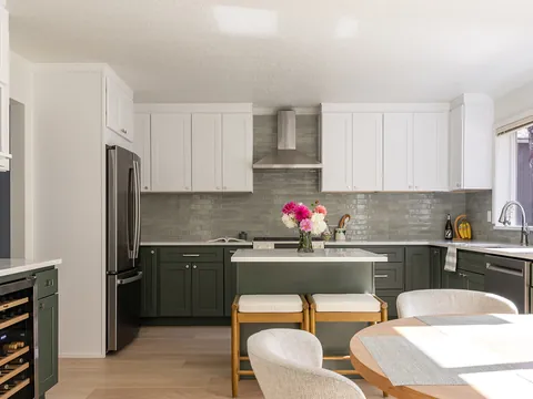
The backsplash sits between the two largest fixed elements in the kitchen, the countertop below and the cabinets above, and its job is to connect them. Most backsplash regrets are color problems: a white tile that looks dingy against the cabinets, a pattern fighting the counter, or grout that turned a calm wall into a grid. This page covers the color decisions only. Materials are compared in backsplash tile materials, and height, edges and outlets are in kitchen backsplashes and wall finishes.
Decide the backsplash third
Pick in this order: cabinets, countertop, backsplash, grout, wall paint. Cabinets and counters cost the most, come in the fewest colors and are the hardest to change, so they set the terms. Tile comes in nearly any color, and grout in dozens, so they can be tuned to what is already chosen. Choosing a tile you love first and then hunting for a counter to suit it works against you. The logic for the first two choices is in countertop and cabinet color pairings.
Three ways to relate the backsplash to the counter
| Approach | What it looks like | Works when | Where it goes wrong |
|---|---|---|---|
| Match | The same slab runs up the wall, or the tile is the counter's background color | The counter has strong veining or movement and should be the only feature | A tile that is nearly the counter color but not quite. A near miss looks like an error; a true match or a clear step away does not. |
| Tone-on-tone | Tile in the same color family as the counter or cabinets, one or two steps lighter or darker | You want a calm room with some depth, for example cream tile over a warm white counter | Everything lands at the same value and the room goes flat. Add texture, a handmade surface or a change of sheen. |
| Contrast | Tile clearly darker, lighter or more colorful than the counter | Counter and cabinets are both plain, and the kitchen needs one point of interest | The contrast color appears nowhere else. Repeat it once, in a light fixture, stools or a runner. |
One busy surface at a time
Count the patterned surfaces. A counter with bold veining, a tile with strong variation, a tile laid in herringbone, and a contrasting grout are each a pattern. A kitchen carries one comfortably and two with care. Three compete.
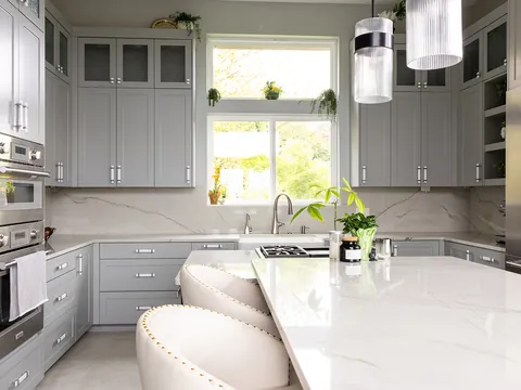
- Busy counter, quiet tile. With a heavily veined or speckled counter, use a plain tile in one of the counter's own colors, usually its background color, with matching grout. Pull the color from the lightest large area of the slab, not from a thin vein.
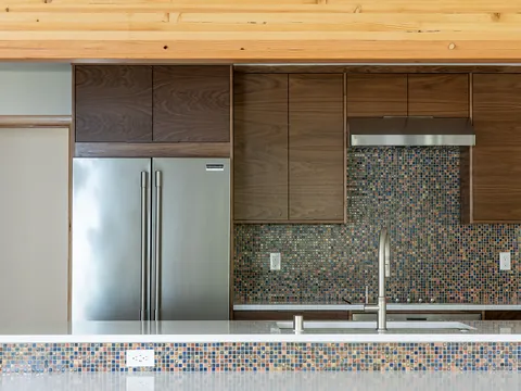
- Quiet counter, expressive tile. A solid or finely flecked counter leaves room for a tile with color, a handmade surface, a pattern layout or a contrasting grout. Choose one of those, not all four.
- Both quiet. Plain counter and plain tile is the safest combination and the one most likely to feel bland. Sheen and texture do the work here: a glossy tile over a honed counter, or a tile with slight surface movement.
Scale matters as much as color. A small mosaic next to a finely speckled granite produces two fine-grained patterns that blur together. Pair a small-scale counter pattern with a larger tile, and broad veining with a simple small or medium tile.
Reading undertones
Most backsplash clashes are between two colors that share a name. "White" tile can lean yellow, pink, green, blue or gray, and you only see which once it is next to another white.
- Use a reference. Hold the tile, the cabinet door sample and the counter sample against a sheet of plain white printer paper. The paper makes each one's lean obvious.
- Check tile against cabinets first. On most walls the tile touches the underside of the upper cabinets along its whole length, so a mismatch there is seen more than one at the counter.
- If you cannot match a white, step away from it. A tile that is clearly creamier or clearly grayer than the cabinets looks intended. One that is a fraction off makes the cleaner of the two look dirty. Matching whites across materials is covered in white kitchens.
- Keep warm with warm. Cream, beige, taupe and warm gray tile sit with warm counters and wood. Blue-gray, crisp white and charcoal sit with cool counters. Green and navy tiles cross over more easily than gray does.
| Cabinets and counter | Tile color that works | Grout |
|---|---|---|
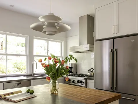
| White cabinets, white counter with gray veining | White matched to the cabinets, or a soft gray pulled from the veining | Matched to the tile; pale gray if you want a faint outline |
| White cabinets, warm speckled granite | Cream or warm off-white taken from the granite's background | Matched, in a warm off-white, not bright white |
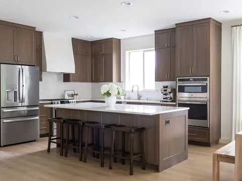
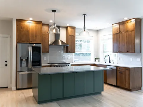
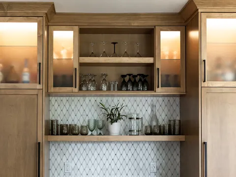
| Natural or stained wood cabinets, plain light counter | Off-white, soft green, or a clay or sand color; avoid yellow-beige, which adds to the orange in the wood | Matched or one step darker |
| Green or blue cabinets, white counter | White or off-white matched to the counter, or a tile two or more steps lighter than the cabinets in the same color | Matched to the tile |
| Dark cabinets, dark counter | A light or mid-tone tile, to keep the wall from disappearing | Mid-tone; white grout on a dark wall shows every joint |
| Two cabinet colors | A neutral that sits with both, usually matched to the counter | Matched |
How grout color changes the tile
Grout is a color choice with as much effect as the tile. The same white rectangular tile can read as a smooth pale wall or as a brick pattern, depending only on the grout.
| Grout compared with tile | Effect | Living with it |
|---|---|---|
| Matched | Joints disappear and the wall reads as one surface. Tile shape and layout matter less. | Hides slightly uneven joints. White on white shows staining over time. |
| One or two steps darker | A soft outline. The layout is visible up close and fades at a distance. | The most forgiving choice for cleaning. |
| Strong contrast | Every joint is a drawn line, and the layout becomes the pattern. | Shows every variation in joint width and every tile that is out of line. Asks more of the tile setter and of a flat wall. |
Four practical points about grout color:
- Cement grout usually dries lighter than it looks when wet in the bucket, and sealers can darken it slightly. Judge the color from a cured sample, not the chart.
- Printed grout charts and plastic sample sticks are approximations. Ask the tile setter to grout a small board of your tile.
- Handmade and irregular tile needs wider joints, so there is more grout on view and its color counts for more.
- The caulk at the counter and in the corners should match the grout color. Most grout makers sell color-matched caulk.
Grout types, joint widths and sealing are a separate decision, covered in the grout guide.
Sheen, texture and light
Color on a backsplash is never seen in flat, even light. Under-cabinet lights sit a few inches from the wall and shine down across it. A glossy tile throws back bright highlights and looks lighter and cooler than its sample. A matte tile holds its color and looks slightly darker. Handmade tile with an uneven face shows a range of tones from one box, which is the point of it, and also means a single sample tile tells you little. Ask for several pieces. The color temperature of the lights shifts everything again, so read under-cabinet and recessed lighting before you settle a white.
Where people go wrong
- Choosing tile in a showroom under its lighting, without the cabinet and counter samples in hand.
- Matching the tile to a vein color in the counter. The vein is a small share of the slab; the tile then covers a whole wall in it.
- Bright white grout with an off-white tile. The grout makes the tile look yellowed.
- Picking a contrasting grout for a tile with uneven edges on a wall that is not flat.
- Treating the backsplash as the place for color when the cabinets or counter are already colorful.
How to test before you order
- Collect a cabinet door or finish sample, a countertop sample and three or four pieces of each tile you are considering.
- Stand the tile upright on the counter sample, under the cabinet sample, in the kitchen itself.
- Look in morning light, afternoon light and under the lights you will use at night.
- Have a small board grouted in your first-choice grout color and look again.
Our article on neutral kitchen backsplash ideas shows quiet combinations, and how to choose a kitchen color scheme puts the backsplash in the context of the whole room. JDI Construction reviews tile, grout and counter samples together during design, before anything is ordered. See how we approach kitchen remodeling in Vancouver.
Common questions
Should grout be lighter or darker than the tile?
For most kitchens, the same value or slightly darker. Grout a shade darker than the tile hides staining and still reads as one surface from across the room. Grout lighter than the tile draws a pale grid over it and shows discoloration first, which is the hardest combination to keep looking clean behind a range.
Should the backsplash match the floor tile?
It does not need to, and an exact match usually looks heavy. The two are seen at different angles and in different light, so a shared undertone is enough. If both are tile, vary the size or the finish, for example a large matte floor tile with a small glossy wall tile in a related color.
Can I change the grout color after the backsplash is installed?
Within limits. Grout colorant products can shift cement grout to a similar or darker color, and they tend to work better going darker than lighter. Going from dark to white, or changing epoxy grout, generally means cutting the grout out and regrouting. It is far easier to test the color on a sample board first.
What color should the outlet covers be?
Close to the tile, not the wall paint or the cabinets. A cover plate within a shade of the tile recedes, and a white plate on a dark or colored tile becomes the most visible thing on the wall. Choose the device color at the same time as the tile, because the electrician orders devices before the tile goes up.
Do I need a different color behind the range?
No. A panel of different tile behind the range is a style choice, not a requirement. If you want one, keep it in the same undertone as the surrounding tile and line its edges up with the hood or the range. A slightly darker grout in that area alone is not practical, because the change will show.
Keep going
- Exploring · Countertops, backsplashes and floors in depthGrout for Kitchen Tile: Cement, Epoxy and Urethane, Plus Joint Width and ColourKitchen tile grout explained: cement, high-performance cement, epoxy and premixed grouts, sanded versus unsanded, joint width, sealing, color and caulk joints.
- Exploring · Countertops, backsplashes and floors in depthBacksplash Tile Materials Compared: Ceramic, Porcelain, Glass, Stone and ZelligeBacksplash tile materials compared for a kitchen: ceramic, porcelain, glass, natural stone and zellige, with care, cutting difficulty and relative cost.
- JDI ConstructionKitchen remodeling in Vancouver, WAOur kitchen remodeling service, recent projects and what to expect.
- Exploring · Color and style guidesKitchen Floor Colors and Mixing Wood TonesChoosing a kitchen floor color: light versus dark floors, wood undertone families, pairing wood floors with wood cabinets, plank width and room-to-room flow.