How to Choose a Kitchen Color Scheme
By the JDI Construction teamReviewed by Arthur Kulchitskiy, CEOUpdated October 20266 min read
Build a kitchen color scheme from the things that are hardest to change. Start with what is staying (floor, adjoining rooms, wood trim), choose the countertop next because stone and quartz come in the fewest colors, then cabinets, then backsplash, and paint last. Keep every material in one undertone family, decide how much light-to-dark contrast you want, and judge real samples in your own kitchen.
A kitchen color scheme is mostly a set of decisions about materials you cannot repaint: cabinets, countertops, tile and floor. Get those to agree and almost any wall color will work. This page gives you the three ideas that make materials agree (undertone, value and proportion) and a method for choosing in the right order.
Start with what is already fixed
Very few kitchens start from nothing. Before you look at a single sample, list what will still be there when the remodel is finished:
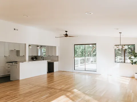
- Flooring that continues from other rooms. If the hardwood in the hall runs into the kitchen, its color is part of your scheme whether you chose it or not. See kitchen floor colors and mixing wood tones.
- Wood trim, doors and windows that will stay stained.
- Adjoining rooms you can see from the kitchen, including their wall color and large furniture.
- Appliances you are keeping, and the finish of the new ones. Stainless is a cool gray, and it is a large area of color.
- The light: which way the windows face and what the electric lighting will be.
Each fixed item narrows the choices, which is helpful. A warm red-brown floor rules out a whole set of cool grays before you waste time on them.
Undertone: the idea that explains most mistakes
Every neutral has a second color hiding in it. A white may lean yellow, pink, green or blue. A gray may lean blue, green or violet, and a beige may lean yellow, pink or green. That lean is the undertone. You do not notice it on a single sample. You notice it the moment two materials with different undertones touch, because each exaggerates the other: a creamy cabinet makes a blue-white countertop look icy, and the countertop makes the cabinet look yellowed.
The working rule is to keep all the large surfaces in one undertone family, warm or cool, and to check every new sample against the ones already chosen, never against the showroom wall.
| Family | What the neutrals look like | Materials that belong to it | Clashes with |
|---|---|---|---|
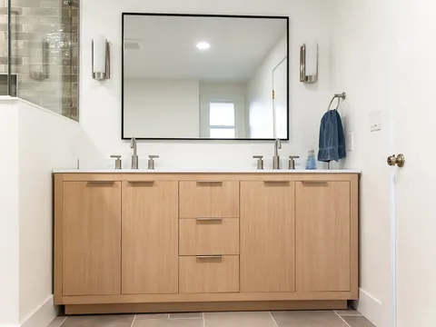
| Warm | Whites that lean cream or yellow; beige; greige with a brown or green cast; taupe | Oak, walnut, cherry and other red or golden woods; stone with gold, tan or rust veining; brass and bronze | Blue-whites, blue-grays, stone with stark blue-gray veining |
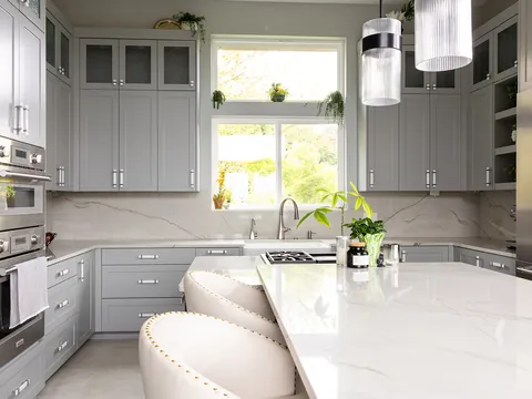
| Cool | Whites that lean gray or blue; true grays; charcoal with a blue cast | Gray-washed or very pale woods; stone with gray or blue-gray veining; chrome, nickel and stainless | Cream, yellow-beige, orange-toned wood |
| Bridging | Neutrals mixed to sit between the two, such as a gray with enough beige in it to read warm in one light and cool in another | Useful when fixed elements disagree, for example a warm floor with stainless appliances | Little, but they can look flat if nothing else in the room has contrast |
Value and contrast
Value is how light or dark a color is, separate from what color it is. It decides whether a kitchen feels calm or graphic. Squint at a kitchen you like: if the cabinets, counters and walls blur into one tone, it is a low-contrast scheme; if you see distinct light and dark blocks, it is high-contrast.
Paint manufacturers publish a number for value called light reflectance value, or LRV. Benjamin Moore defines it as a measurement that expresses the percentage of light reflected from a surface, on a scale from 0 (absolute black) to 100 (pure white). Three examples from that manufacturer show how far apart values sit: Cloud White OC-130, a soft white, has an LRV of 85.05; Edgecomb Gray HC-173, a light warm neutral, 63.09; and Kendall Charcoal HC-166, a dark gray, 14.61. Countertops and tile seldom carry an LRV, so compare them by eye against paint chips whose numbers you know.
| Contrast level | What it looks like | Effect | Watch for |
|---|---|---|---|
| Low (all values close) | White cabinets, pale counter, pale tile | Quiet and spacious; hides the room's edges | Can look flat. Needs texture, wood or metal to give the eye something |
| Medium | Mid-tone cabinets with a light counter, or light cabinets with a mid-tone floor | Relaxed, forgiving of crumbs and wear | Undertone clashes show most at mid values |
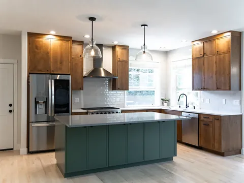
| High | Dark cabinets with a white counter, or white cabinets with a near-black island | Crisp and defined; draws attention to shapes and lines | Shows every misaligned door and every seam; dark surfaces show dust and fingerprints |
Proportion: the 60-30-10 idea
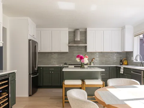
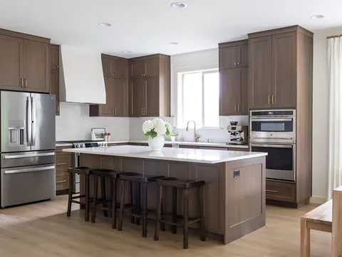
Designers often describe a balanced room as roughly 60 percent one dominant color, 30 percent a secondary color and 10 percent an accent. It is a rule of thumb, not a standard, and nobody measures it. In a kitchen the useful translation is this: the cabinets are the dominant color because they cover the most area; the countertop, backsplash and floor together are the secondary; and the accent is hardware, light fixtures, stools and whatever sits on the counter. Walls barely count, because cabinets and tile cover most of them.
The point of the idea is that the three parts should be unequal. A kitchen split evenly between two strong colors has no leader and looks restless.
How many materials is too many
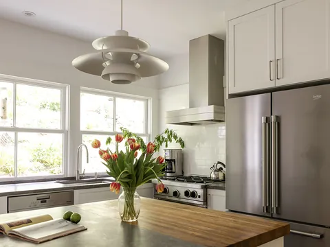
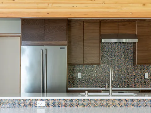
Count the distinct finishes you can see from the doorway: cabinet color, a second cabinet color or wood, countertop, backsplash, floor, metal finish, wall paint. As a working guide of ours, not a standard, once the count passes about seven the room starts to look assembled instead of designed, and no more than one or two finishes should have a strong pattern. A useful limit is one "busy" surface per kitchen. If the countertop has bold veining, the backsplash and floor should be quiet. If the floor is a patterned tile, the countertop should be plain. More on this in countertop and cabinet color pairings and backsplash and grout colors.
A step-by-step method
- List the fixed elements and decide whether each is warm or cool. If most are warm, the scheme is warm.
- Pick a contrast level (low, medium or high) from kitchens you have saved. Do this before colors, since it removes half the options.
- Choose the countertop or the cabinet color first, whichever you feel strongest about. If you have fallen for a particular slab, it leads. If you know you want green cabinets, they lead. The cabinet colors page covers how each color family behaves.
- Choose the other one to suit it, holding the real samples together.
- Add the floor, if it is changing, as a value step away from the cabinets so the two do not merge.
- Choose the backsplash to connect counter and cabinet. It is the mediator, not a fourth star.
- Choose metal finishes for the faucet, hardware and lighting. See mixing metal finishes.
- Choose wall and trim paint last, from the undertone already established.
- Assemble everything in the kitchen and look at it morning, afternoon and evening before anything is ordered.
Sampling in your own light
Showrooms are lit to flatter everything. Your kitchen has one set of windows facing one direction and the light fixtures you choose. Bring the finalists home, view them where they will be installed, and look under the electric light you will use at night as well as in daylight. If the lighting is being replaced, ask for the color temperature of the new fixtures and look at samples under a bulb of that type. The under-cabinet and recessed lighting page explains color temperature and CRI.
Where schemes go wrong
- Choosing each item separately, in different stores on different days, and meeting the combination for the first time at installation.
- Matching by name. "White" quartz, "white" cabinets and "white" tile can be three different undertones.
- Too many stars. A veined counter, patterned tile and a two-color cabinet plan all compete.
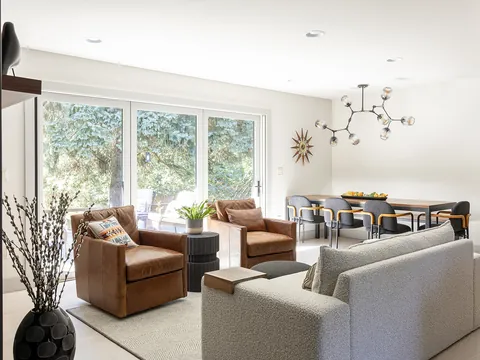
- Ignoring the next room. In an open plan, the living room floor and sofa are part of the kitchen's palette.
- Deciding from a screen. Monitors and phone displays shift color, and photographs are edited.
Where to go next
If you already know the look you are after, kitchen styles explained lists the colors and materials that define each one. JDI Construction works through selections as part of its design process and shows them together in a 3D design layout before anything is ordered. To start a plan for your home, see our Vancouver kitchen remodeling page.
Common questions
Should the kitchen match the rest of the house?
It should relate to what you can see from it, not match it. Stand in the kitchen and note every floor, wall color and large piece of furniture in view. Carry at least one of those colors or wood tones into the kitchen and keep the same undertone family, and the rooms will read as one house even if the kitchen is bolder.
Is it a mistake to choose paint first?
Usually, yes. Paint can be mixed in thousands of colors and changed in a weekend, while a countertop slab, a tile or a cabinet finish comes in a limited range and stays for many years. Choose the limited, permanent materials first and let the wall color be the one that adapts to them.
How do I tell what undertone a material has?
Compare it with something else. Hold the sample against a sheet of plain white printer paper and then against a second sample of a similar color. On its own a white or gray looks neutral; next to another one, the yellow, pink, green or blue in it shows immediately.
Can I mix warm and cool colors in one kitchen?
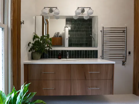
Yes, if one temperature clearly leads and the other appears as a deliberate accent, such as cool blue-gray cabinets with warm brass hardware and a wood floor. What looks wrong is two near-neutrals of opposite temperature side by side, for example a creamy cabinet against a blue-white countertop, because each makes the other look dirty.
How many samples should I order?
Fewer than you think, but real ones. Narrow each material to two or three candidates using small chips, then get the largest sample available of each finalist: a full cabinet door, a countertop piece you can lay flat, several tiles. Deciding from a dozen small chips is harder and less reliable than comparing three large samples.
- Benjamin Moore: Cloud White OC-130 (LRV 85.05, with the manufacturer's definition of light reflectance value)
- Benjamin Moore: Edgecomb Gray HC-173 (LRV 63.09)
- Benjamin Moore: Kendall Charcoal HC-166 (LRV 14.61)
Checked October 2026. Rules, fees and programs change; confirm the current requirement with the agency before you rely on it.
Keep going
- Exploring · Color and style guidesKitchen Cabinet Colors: Whites, Greens, Blues, Neutrals and Wood TonesHow white, green, blue, neutral, dark and wood-tone kitchen cabinets behave: depth of color against room size and light, sheen, wear and hardware pairing.
- Planning · Color and style guidesCountertop and Cabinet Color Pairings That WorkHow to pair countertops with white, wood, green, blue and dark cabinets: warm versus cool stone, veining scale, contrast, the backsplash and slab viewing.
- Exploring · Color and style guidesChoosing Kitchen Colors for Pacific Northwest LightHow overcast Pacific Northwest daylight changes kitchen colors, why whites turn gray or blue here, what LRV tells you, and how to test samples over a day.
- JDI ConstructionKitchen remodeling in Vancouver, WAOur kitchen remodeling service, recent projects and what to expect.