Kitchen Cabinet Colors: Whites, Greens, Blues, Neutrals and Wood Tones
By the JDI Construction teamReviewed by Arthur Kulchitskiy, CEOUpdated October 20266 min read
Choose a cabinet color by depth first and hue second. Light cabinets suit small or dim kitchens and show splashes; mid-tones hide daily wear and are the most forgiving; dark colors need plenty of light and show dust and fingerprints. Muted colors with some gray in them age better than bright ones. Always decide from a finished sample door viewed in your own kitchen.
Cabinets cover more of a kitchen than anything else, so their color is the color of the room. It is also the hardest to change afterward. This page describes how each color family behaves once it covers every door and drawer front in the room, and what to check before you sign off on one.
Think in depth before hue
Whether a cabinet is light, medium or dark affects daily life more than whether it is green or blue. Depth is measured for paint as light reflectance value. Benjamin Moore defines LRV as a measurement that expresses the percentage of light reflected from a surface, from 0 (absolute black) to 100 (pure white). The bands below are our working groupings, not an industry standard.
| Depth | Rough LRV | Room it suits | Shows | Hides |
|---|---|---|---|---|
| Light | About 70 and above | Small kitchens, low ceilings, limited daylight | Splashes, scuffs, grease near the range | Dust, water spots, small dents |
| Mid-tone | About 30 to 70 | Almost any room; the most forgiving choice | Undertone clashes with counters and floors | Fingerprints, crumbs, everyday marks |
| Dark | Below about 30 | Larger kitchens with good daylight and strong electric lighting | Dust, fingerprints, chips, misaligned doors | Stains and discoloration |
A dark color absorbs most of the light that reaches it, so the kitchen needs more light to feel the same brightness. If you are going dark, plan the lighting at the same time.
The color families
Whites and off-whites
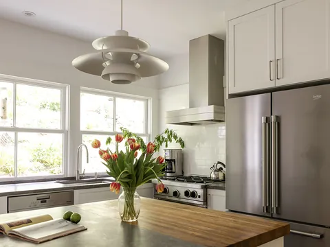
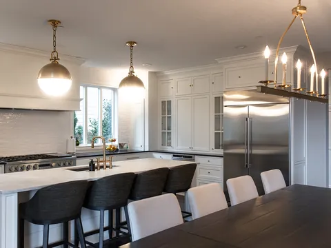
White makes the cabinets recede and the room feel larger, and it goes with any countertop of the same undertone. Its difficulty is that it must agree with every other white in the room. That subject has its own page: white kitchens.
Greens
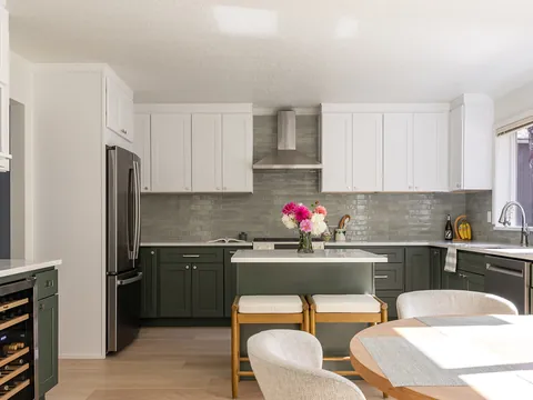
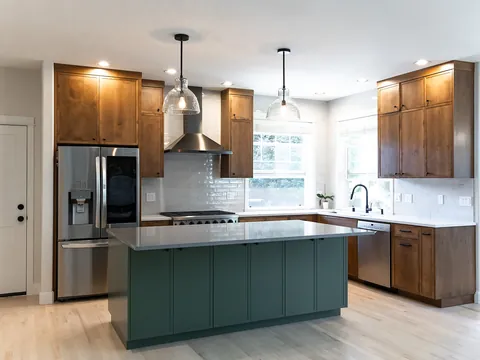
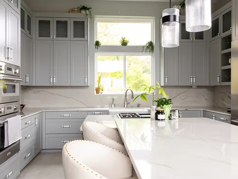
Green is close to a neutral in a kitchen because it sits comfortably with wood, stone and brass. Greens divide into three useful groups. Sage and gray-greens are mid-tone, soft and easy to live with; Saybrook Sage HC-114, which the manufacturer describes as an aloe hue cooled with gray, has an LRV of 45.46. Olive and moss greens lean yellow and warm, and suit warm stone and walnut. Deep forest and near-black greens are dramatic and need light; Backwoods 469, a blackened forest green, has an LRV of 12.68. The greens that disappoint are bright, clear ones with no gray in them, which can look like a painted toy at cabinet scale.
Blues
Blue is a cool color, and on cabinets it needs something warm beside it: a wood floor, brass hardware, a warm white counter. Navy acts as a softer alternative to black and pairs well with white and with wood; Hale Navy HC-154 has an LRV of 8.36, which puts it among the darkest colors on this page. Gray-blues and slate blues are calm mid-tones. Pale blue-greens such as Palladian Blue HC-144 (LRV 60.4), a soft, airy blue-green, read as fresh in good light and can look chilly in a dim room.
Neutrals: greige, taupe, mushroom and gray
Warm neutrals give the softness of white with more tolerance for fingerprints. Revere Pewter HC-172 (LRV 55.05), which the manufacturer describes as a bridge between warm and cool tones, is an example of a mid-tone greige. These colors depend heavily on the materials around them, because their undertone (green, pink or violet) shows as soon as a countertop with a different undertone is set on top. Cool, blue-leaning grays are the least forgiving member of this family in low or overcast light.
Black and charcoal
Soft blacks are usually easier than a pure black because they keep some depth in shadow. Wrought Iron 2124-10, described by the manufacturer as a relatively soft black, has an LRV of 8.17. Black cabinets make the countertop and hardware stand out, show dust on horizontal edges such as Shaker door rails, and reveal any chip. A matte finish hides fingerprints poorly; a satin finish is easier to wipe.
Wood tones
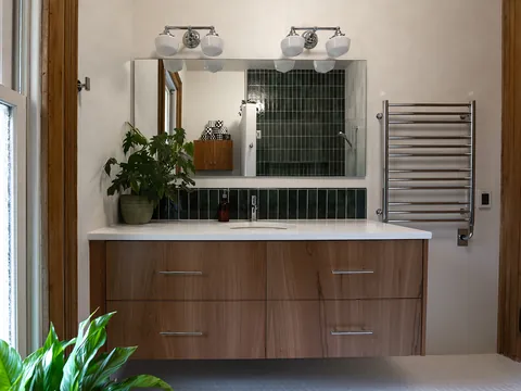
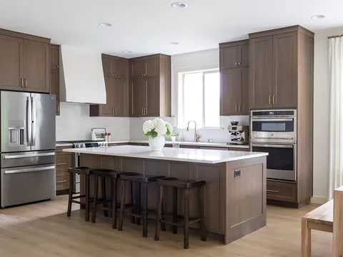
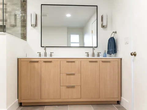
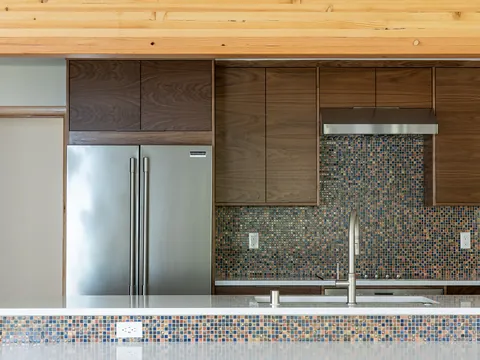
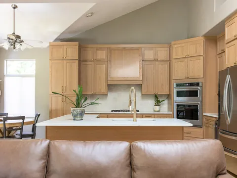
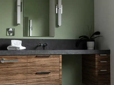
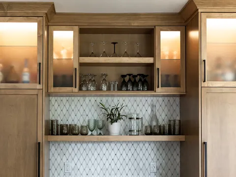
Stained or natural wood is a color choice too. Pale woods such as natural maple or white oak read as light neutrals with texture. Mid-brown woods are the most forgiving of wear. Dark stains behave like dark paint for dust and light. Wood also changes color with age and light exposure, which paint largely does not. Species and stain are covered in cabinet wood species compared, and the practical differences are in painted vs. stained cabinets.
The six paint colors named above are examples to help you picture each family, with LRVs from the manufacturer's own pages. They are not recommendations, and your cabinet line may or may not offer a match.
Lasting choices and trend claims
We do not name a most popular cabinet color here, because that changes from one survey to the next and we will not state a trend we cannot point to in a published report. What can be said from experience is which qualities date slowly:
- Muted over saturated. Colors with gray or brown in them keep looking deliberate. Bright, pure colors are tied to the year they were chosen.
- Colors found in materials. Whites, stone colors, greens, deep blues, browns and blacks all occur in wood, stone and metal, which is why they sit well with countertops and floors.
- Suited to the house. A color that fits the age and style of the home lasts longer than one borrowed from a different kind of house. See kitchen styles explained.
- Bold in small doses. Putting the strong color on an island or one run keeps the option of changing it later. Two-tone kitchens shows how.
Sheen on cabinets
Sheen affects both look and upkeep. Higher gloss is easier to wipe and makes a color look deeper and slightly darker, but it shows every dent, brush mark and uneven panel. Lower sheen hides surface flaws and looks softer, but very flat finishes mark easily and hold grease. Most painted cabinets are finished at a satin or similar level as the compromise. On dark colors the sheen choice matters more, because reflections and fingerprints are far more visible than on white. Ask to see the sample door in the exact sheen that will be supplied. The coatings themselves are explained in cabinet finishes explained.
Hardware pairing
| Cabinet color | Warm metals (brass, bronze) | Cool metals (nickel, chrome, stainless) | Matte black |
|---|---|---|---|
| White and off-white | Adds warmth; classic with warm whites | Crisp; suits clean and cool whites | High contrast; hardware becomes a pattern |
| Green | The natural partner, especially for deep greens | Works with gray-greens; can feel cold on olive | Good on sage; disappears on dark green |
| Blue and navy | Strong, warm contrast | Quiet and traditional | Low contrast on navy |
| Greige and taupe | Brings out the warmth | Pulls the color cooler | Gives definition to a soft color |
| Black and charcoal | Stands out clearly | Sharp and modern | Tone-on-tone; pulls are found by feel |
| Wood | Warm on warm; suits walnut and oak | Lightens and modernizes | Clean contrast on pale wood |
Sizes, placement and how finishes wear are in the cabinet hardware guide.
What to check before you approve a cabinet color
- A finished sample door in the real color, door style and sheen, not a chip.
- The door standing upright in your kitchen, next to the countertop sample and the floor.
- How it looks in daylight and under the evening lighting.
- Whether touch-up material is supplied, and how a chip will look on that color.
- For painted five-piece doors, that you understand fine hairline cracks at the joints can appear as wood moves, and that they are more visible on dark colors.
- For custom-matched colors, that the match is approved from a sample made by the cabinet maker, not from the paint store's chip.
Where to go next
Once the cabinet color is settled, the countertop is the next decision: see countertop and cabinet color pairings. JDI Construction reviews finished door samples with you during design and shows the chosen colors in a 3D design layout before the cabinet order is placed. Details are on our Vancouver kitchen remodeling page.
Common questions
Which cabinet colors show wear the least?
Mid-tone colors and stained wood with visible grain. They hide fingerprints, crumbs, small chips and water spots better than either extreme. White shows splashes and scuffs, and very dark painted cabinets show dust, grease marks and any chip that exposes the paler material underneath.
Is a bold cabinet color bad for resale?
We have no data that would let us put a number on it, so we will not guess. The practical view is that a muted color on good cabinets is rarely a problem, and that cabinets can be repainted if a future owner disagrees. If resale within a few years is the main goal, keep the perimeter neutral and put the color on the island.
Can I see my exact color before ordering?
Ask for a finished sample door in the actual color, door style and sheen. Most cabinet lines will supply one, sometimes for a refundable charge. A paint chip is not a substitute, because the cabinet finish is a different coating applied by a different process and the door profile changes how light falls on it.
Can any paint color be used on cabinets?
It depends on the cabinet source. Stock lines offer a short fixed list. Many semi-custom and custom lines offer a house palette plus custom color matching to a paint manufacturer's color, usually at added cost. If a specific color matters to you, confirm that the line can match it before you commit to that line.
Do dark cabinets make a kitchen look smaller?
They make the cabinet mass more visible, which can make a small room feel fuller. In a kitchen with good daylight, a light countertop and a pale ceiling, dark cabinets read as rich instead of heavy. In a small, dim kitchen, limiting the dark color to the base cabinets or the island keeps the upper half of the room light.
- Benjamin Moore: Saybrook Sage HC-114 (LRV 45.46, with the manufacturer's definition of light reflectance value)
- Benjamin Moore: Backwoods 469 (LRV 12.68)
- Benjamin Moore: Palladian Blue HC-144 (LRV 60.4)
- Benjamin Moore: Hale Navy HC-154 (LRV 8.36)
- Benjamin Moore: Revere Pewter HC-172 (LRV 55.05)
- Benjamin Moore: Wrought Iron 2124-10 (LRV 8.17)
Checked October 2026. Rules, fees and programs change; confirm the current requirement with the agency before you rely on it.
Keep going
- Exploring · Color and style guidesTwo-Tone Kitchens: Mixing Cabinet Colors and WoodHow to plan a two-tone kitchen: island versus perimeter, dark lowers with light uppers, paint with wood, where each color stops, and choosing the countertop.
- Planning · Cabinets and hardware in depthPainted vs. Stained Kitchen CabinetsPainted vs. stained kitchen cabinets: how each looks, wears and touches up, why painted doors show hairline joint cracks, and how to mix both in one kitchen.
- Exploring · Color and style guidesWhite Kitchens: Choosing the Right White for Cabinets, Counters and WallsHow to choose whites for kitchen cabinets, counters, tile, walls and trim: undertones, LRV, sheen, matching across materials and keeping white warm.
- JDI ConstructionKitchen remodeling in Vancouver, WAOur kitchen remodeling service, recent projects and what to expect.