


A neutral kitchen backsplash uses soft whites, beiges, greiges, or light grays—subtle hues that pair with any cabinet or countertop. Simple textures like subway tile, zellige squares, or honed stone keep the look timeless, boost resale value, and let accent colors shine effortlessly.
Muted never means boring—neutral kitchen backsplashes can steal the show without shouting for attention.
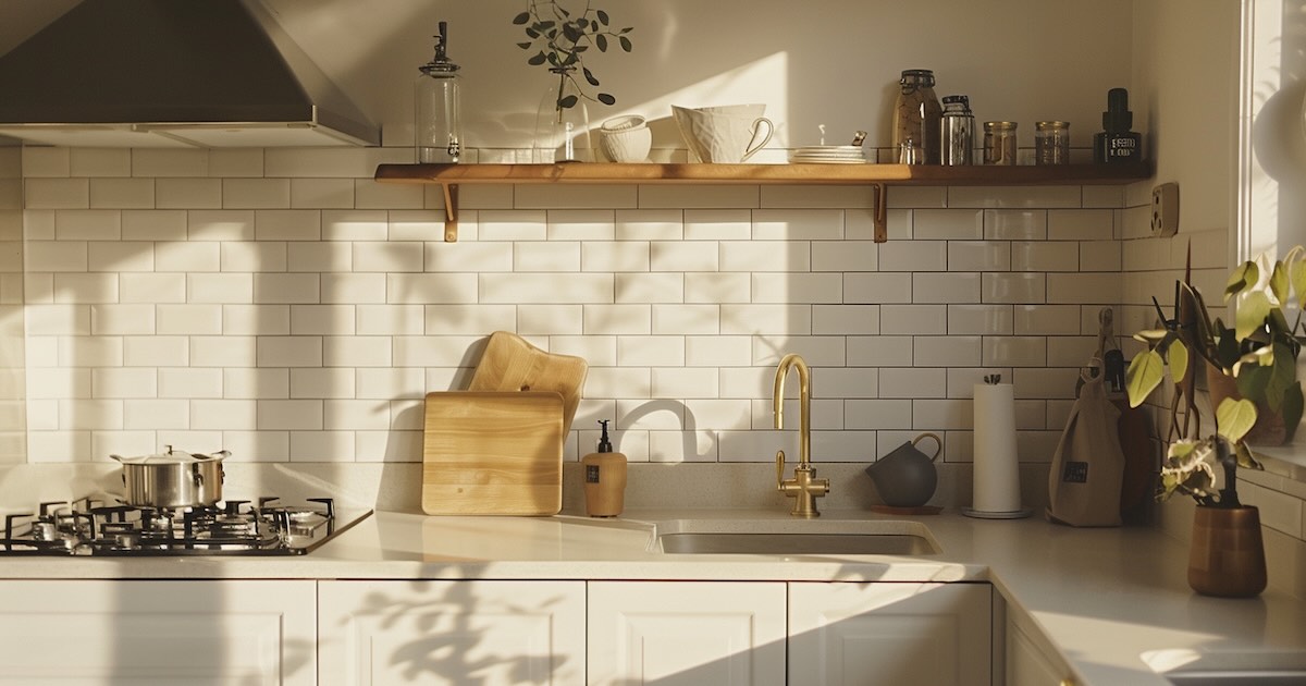
Why Pick a Neutral Tile Backsplash?
White shaker cabinets, walnut shelves, matte-black pulls—styles shift every season. A neutral backsplash stays steady through every trend cycle, boosting resale and saving you repaint headaches later. Plus, lighter hues bounce daylight around the room, making even galley kitchens feel roomy. For a deeper look at surface choices, read our full countertop guide before you shop tile.IMAGE-ALT-HERE [neutral-subway-tile-kitchen]
Little extras that matter
- Flexibility: Swap décor colors each holiday without clashing.
- Longevity: Buyers shopping Zillow love a blank canvas.
- Cleaning ease: Pale tile shows splatters quickly—so you wipe fast, stains don’t linger.
Let’s see which materials tick those boxes.
12 Timeless Neutral Backsplash Ideas
Below is your quickfire list—Google loves concise answers, and you’ll love the inspiration.
- Classic white subway tile – glossy or matte, 3×6 inch bricks fit every era.
- Creamy zellige squares – Moroccan hand-cut charm in warm off-white.
- Light-gray elongated subway – stretches walls visually.
- Beige marble herringbone – subtle veining, luxe whisper.
- Greige stacked stone veneer – earthy texture, indoor-outdoor vibe.
- Off-white beadboard panel – cottage comfort behind a range.
- Almond porcelain chevron – gentle pattern without bold color.
- Sand-tone travertine slabs – minimal grout lines, spa calm.
- Bone-colored penny rounds – playful dots, neutral palette.
- Taupe glass mosaic strips – light catchers, easy to wipe.
- Soft limestone ledger tile – dimensional yet quiet.
- Pale quartz slab backsplash – seamless counter-to-wall flow.
1. Classic White Subway Tile
Perfectly imperfect? Absolutely. Slight surface ripples add handmade charm while bright glaze bounces light like crazy. Keep grout thin for modern; widen it and choose charcoal for vintage café vibes.
2. Creamy Zellige Squares
Sun-baked in Fez, glazed by hand, each piece reflects light differently—think candle-lit shimmer at dinner. Pair with brass faucets for laid-back luxury.
3. Light-Gray Elongated Subway
Long 2×10 rectangles stretch a wall the way pinstripes lengthen legs. Go vertical if ceilings are short or horizontal for classic serenity.
4. Beige Marble Herringbone
Feels like an urban Paris flat. Choose honed finish to avoid too much sheen; seal annually and pasta sauce won’t haunt you.
5. Greige Stacked Stone Veneer
Texture lovers, rejoice. Stone slices climb the wall, casting micro-shadows that shift from dawn to dusk. Seal to fend off spaghetti splashes.
6. Off-White Beadboard Panel
You know what? Sometimes paintable MDF beats tile on budget and speed. Add a tall rail, brush on semi-gloss, and you’re Sunday-brunch ready.
7. Almond Porcelain Chevron
Chevron’s dynamic “V” shape keeps neutral colors lively. Install as peel-and-stick sheets—stress-free alignment.
8. Sand-Tone Travertine Slabs
Large-format slabs minimize seams. Fill natural pits for a crumb-free surface or embrace them for rustic soul.
9. Bone-Colored Penny Rounds
Small circle tiles read vintage soda-shop yet feel fresh in monochrome. Unsanded grout makes wiping easier.
10. Taupe Glass Mosaic Strips
Glass reflects under-cabinet LEDs like lake water at twilight—dreamy without color overload. Use epoxy grout to avoid stains.
11. Soft Limestone Ledger Tile
Thin, rough-cut strips deliver spa serenity—great behind a pot-filler where steam dances across stone.
12. Pale Quartz Slab Backsplash
Countertop climbs up the wall for zero grout lines—chef-level cleanability. Match veins for custom-home polish.
Neutral Color Cheatsheet: Tile Shades That Work
Not sure what material you’re working with? Quickly identify your current countertop to match undertones.
- Snow-white: crisp, modern, pairs with black hardware.
- Ivory: warmer undertone, cozy with oak cabinets.
- Greige: gray-beige mix, plays nice with stainless steel.
- Fog-gray: cool elegance, perfect against navy lowers.
- Sand: beachy feel, matches rattan stools.
Hang paint swatches under your uppers; morning, noon, and LED lighting shift tones dramatically. Take photos at each hour—phones see undertones we miss. Tight budget? Check our budget countertop options to keep costs in check.
How to Choose a Neutral Backsplash
- Match tone to cabinets – hold samples next to door fronts; undertones must agree.
- Check with countertop – speckled granite wants simpler tile; plain quartz can handle texture.
- Test in your lighting – warm bulbs mute cool grays; daylight reveals pink undertones.
- Decide grout drama – contrast for pattern pop, matching for seamless calm.
Follow these four checkpoints and remorse won’t visit two weeks after install.
FAQ: Neutral Kitchen Backsplash
Q: What tile colors are considered neutral for a kitchen backsplash? A: Think snow-white, ivory, greige, fog-gray, and sand tones—hues without vivid pigment that blend with most cabinet and countertop palettes.
Q: How do I keep a neutral backsplash from looking boring? A: Add texture or pattern—zellige sheen, herringbone layout, or penny-round shape—while staying in a muted color family.
Q: Is a white subway tile backsplash still in style in 2025? A: Absolutely. Its simple geometry and adaptable grout options keep it timeless, especially paired with modern hardware and lighting.
Ready to Refresh Your Kitchen?
Still staring at builder-grade beige? Grab a free design estimate and let our team mock up subway, zellige, or quartz-slab options tailored to your cabinets. Your neutral-loving future self will thank you.


